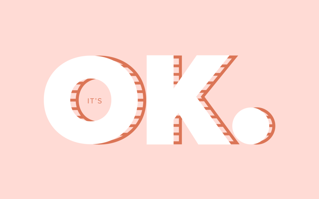
It’s OK to Design for Fun
Happy Friday! This is not a lengthy deep or personal post but I’m try to put more effort into my website and blog. The truth is like genuinely like designing and writing so I’m using my season of change to implement new creative habits. Before April and...
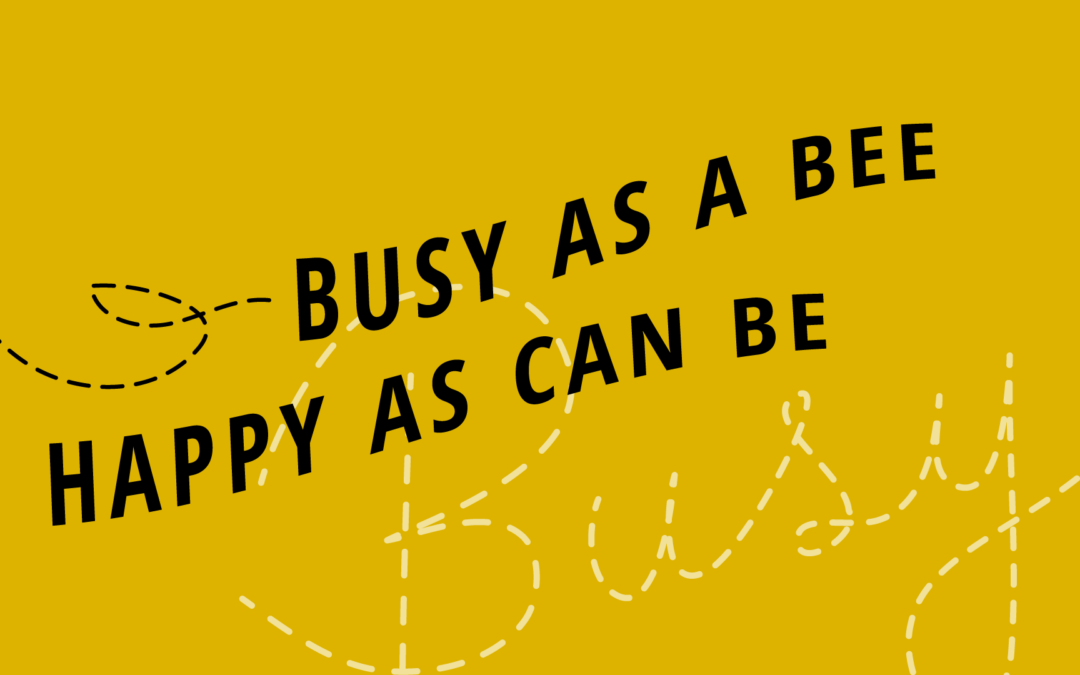
Step-by-Step Hand Lettered Graphic
Step-by-Step Hand Lettered Graphic About the Project During the day I am almost always styling WordPress Websites or creating branded graphics for social media for clients, but I like to design outside of the ole 9:00-5:00, too! I attend The Water’s Edge church...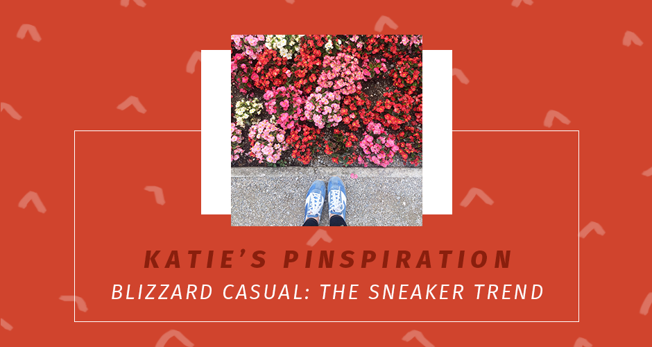
Blizzard Casual – Sneaker Trend
My favorite look from last winter was the dominance of super cool sneakers. I cannot tell you enough how happy it makes me when A) practical and comfortable things are fashionable and B) when said practical and comfortable fashion lasts for more than one season. It...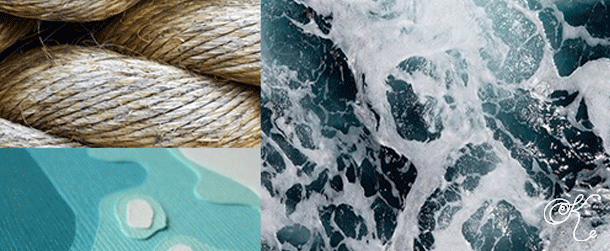
Rejected Mood Board
It’s been awhile! I’ve had several irons in the fire, and I’m trying to work on some larger posts so, in the meantime, here’s a rejected mood board for a freelance/pro bono campaign I worked on. Obviously, the campaign and organization had very...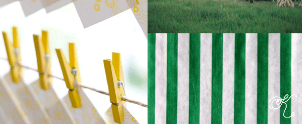
Lartin Wedding Mood Board
I just needed a small dose of “pretty” in my day today or a break from thinking or both so here we go. It may seem cheesy or unnecessary but I like to create a mood board when I’m brainstorming for new projects and coming up with concepts for how...
Katie Kassel
Graphic and web designer in Omaha, Nebraska. Logos, branding, WordPress websites, and weddings.