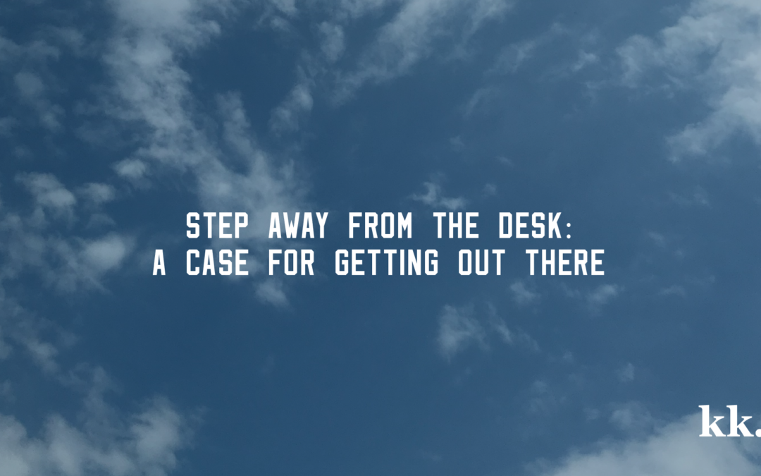
Step Away From the Desk
It’s taken me nearly 30 years of sitting at desks to realize that I’ve been sitting at desks for THAT LONG. You’ve heard the sad, morbid warnings of sitting for hours on end. Most are based on research, and I am big fan of science and facts. Scary...
Day of the Week Sunglasses
It’s late April in the Midwest which could mean ANYTHING weather-wise. But on this particular day, it’s sunny and 60 degrees and I’m happy. Been in a mental rut all week and decided to do a short series to design for fun. This particular series was...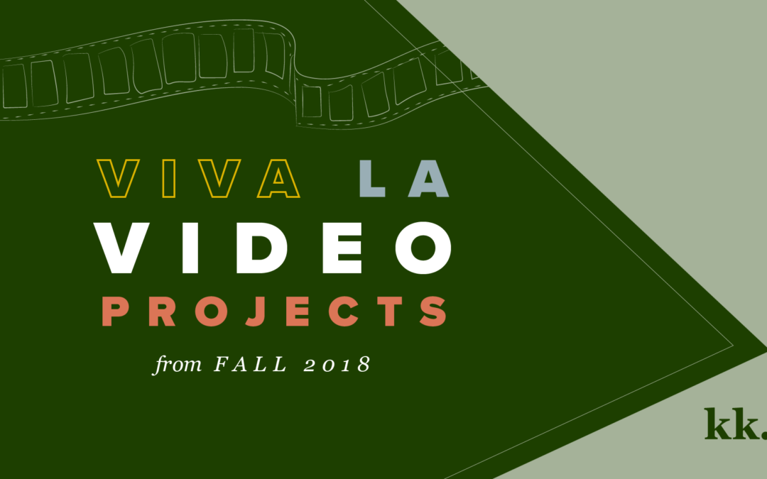
Video Class Recap
I committed myself to one class each semester at a local university for the last year (and continuing this year). The experience has been positive in so many ways including but not limited to getting out of the house, meeting people, being uncomfortable, learning new...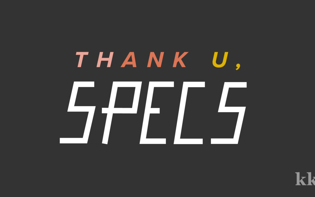
Thank U, Specs: What Are Specs and Why Do Designers Need Them?
Every once in awhile the universe rewards me for my devotion to both pop culture and graphic design which allows me to bring you such hits as Thank U, SpecsTM. Have you ever worked with a graphic designer or printer? Maybe you’ve run an ad in a high school...My Logo Process
There are numerous articles about the importance of logos and branding; why they’re both necessary and an investment. There are also SO many options available to a business, organization, or individual when choosing a logo. How is a person to choose? Most things...
Katie Kassel
Graphic and web designer in Omaha, Nebraska. Logos, branding, WordPress websites, and weddings.